
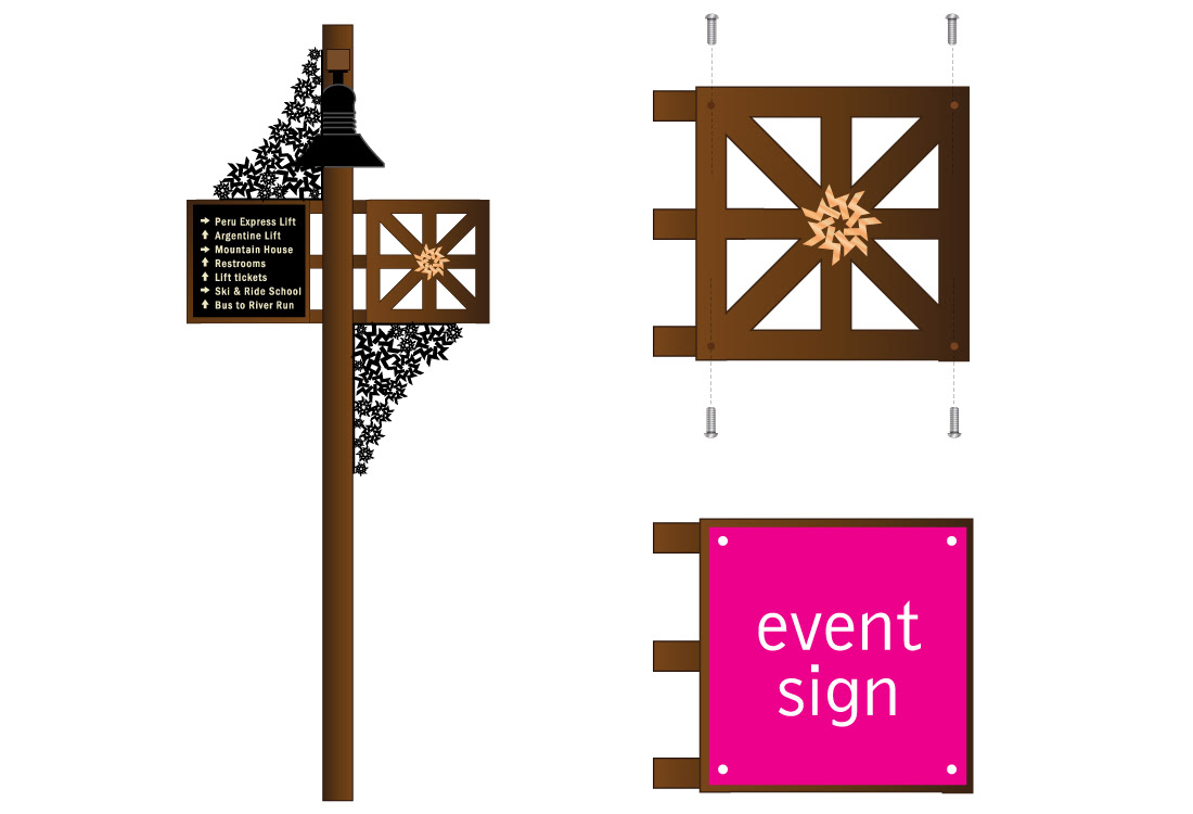
I came up with a way to display the ever changing event signs on the right side of the light poles. There are nylon-cased threaded holes in the corners and wooden caps to cover the holes when not in use. When there is an event, the signs are attached. When there are no events, the decorative wooden design is showing.
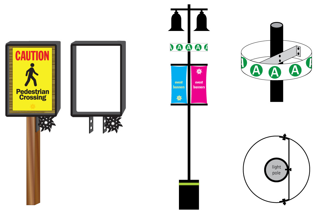
Above left is a metal frame for small street signs. This frame keeps the design elements of the overall brand while also protecting both the edges of the sign from the harsh winter climate and any injuries sustained from the sharp edges of the sign.
The light post on the right is designed for a large parking lot. It showcases what section your car is parked in. The circular "A" sign (mounted below the light fixture) is designed to rotate with the breeze so that the "A" letters appear to be spinning, which would catch the eye much easier and faster than a static sign.
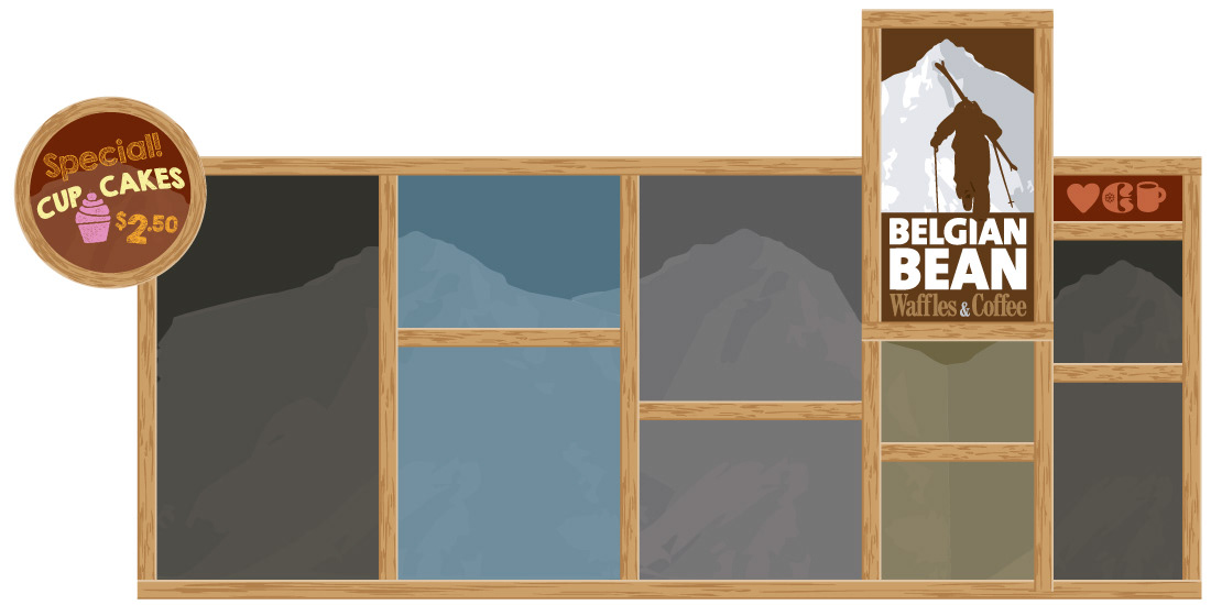
Above is a design for a menu board called the Belgian Bean. I came up with the idea to adjust for ever-changing menus by having the four horizontal frame boards move up and down, based on adding or deleting menu items. The menu would be written in chalk markers so all the employee does is move the board based on the length of text.


skills design thinking
tools Adobe Illustrator / Photoshop
involvement sole designer and creative person on these projects