
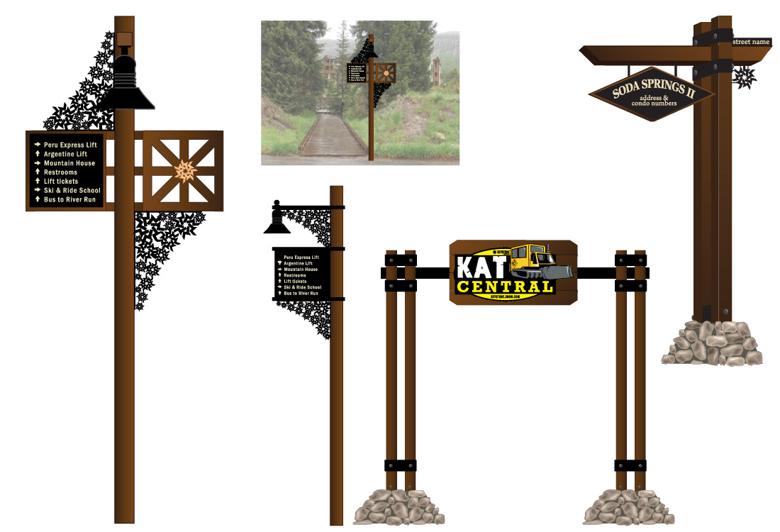
These light poles were part of a resort wide re-design project. There was a big push to use the Keystone logo in the design. I looked into metal and plastic as possibilities to manufacture these elements. The harsh environment at these elevations has to always be taken into consideration. I wanted a cast iron type of look but I wanted it to last for many years. Plus, the white snow and icicles settling on top and inside the 3-d logos is a very cool look. I also came up with a way to display event signs on the right side of the light poles. The KAT Central arch is at the top of the mountain and the neighborhood sign is on the right.
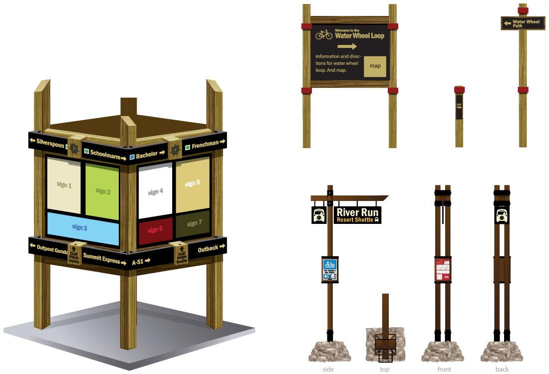
Above is a four-sided information kiosk with display/storage for trail maps and directional signage incorporated. Top right are designs for the bike trail system and bottom left is a four-sided view of the transportation system sign.
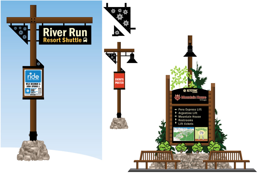
Above is a design for signage for the transportation department. The director and I planned out new routes and I designed the new map in Illustrator. I then came up with the new designs for the poles as well as the signage.
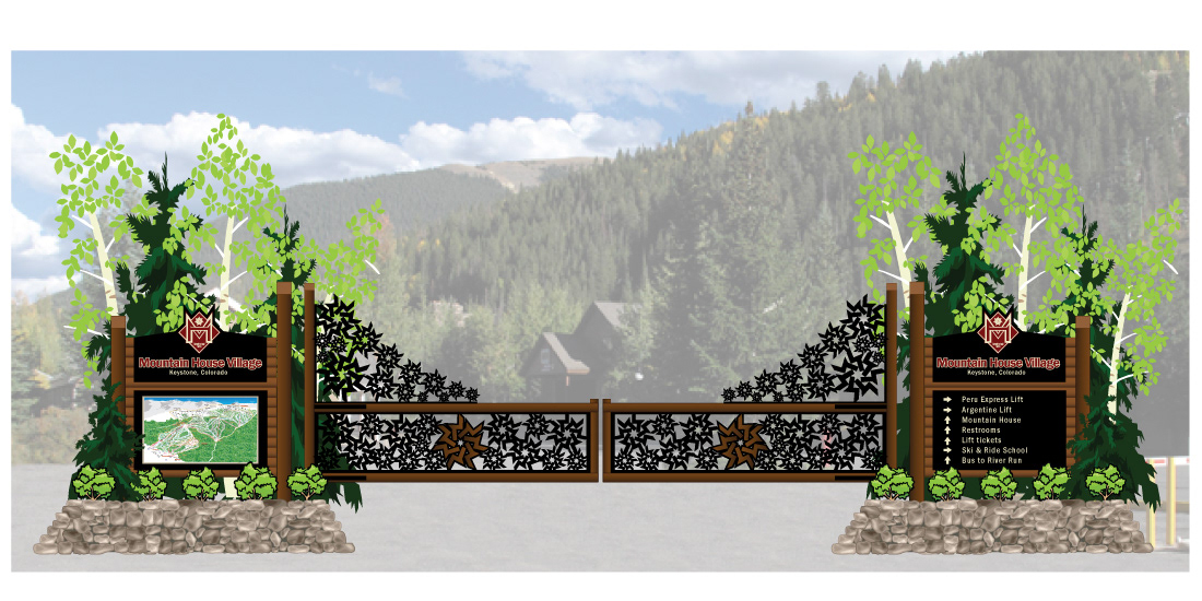
Above is a "grand entrance" gate design incorporating the Keystone logo into the iron work of the gates.
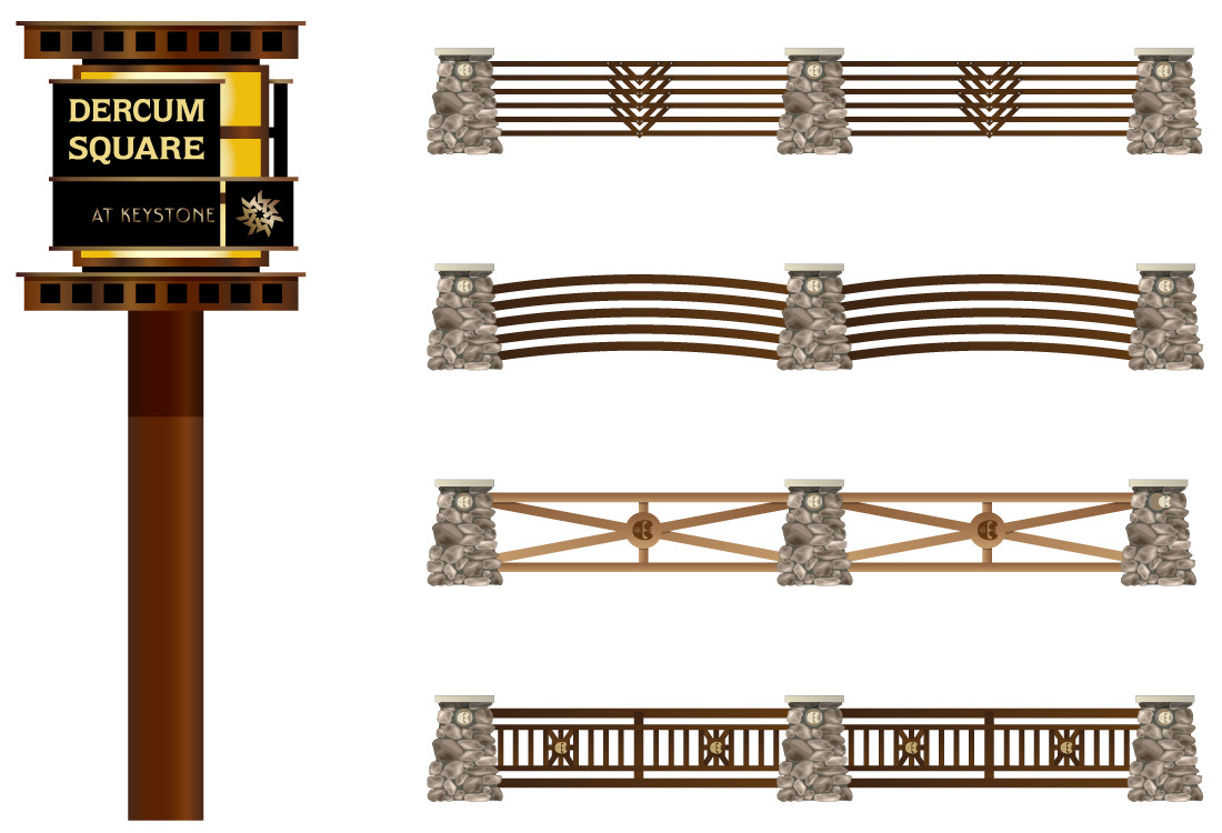
Above is a design for accent lights along a path in Dercum Square. Also some designs for fencing.
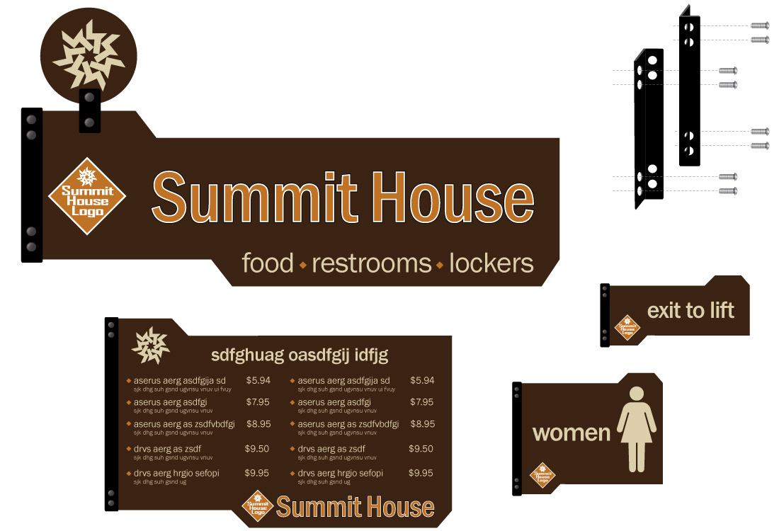
Above is a sign system for indoor spaces at the Summit House.
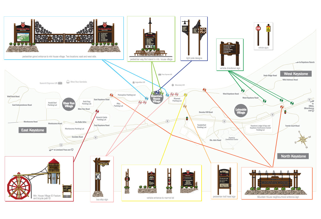
Above is an overview map of what it is and where it goes.
skills design / photography
tools Adobe Illustrator / Photoshop
involvement sole designer and creative person on these projects / assistance with engineers on some projects